
New Look For AdventistHoops
By Dustin Comm
The original AdventistHoops logo was created in 2023 when I started the Instagram account and needed a symbol to represent the celebration of Seventh-day Adventist basketball.

Drawing on inspiration from the Adventist Church logo, I commissioned a design that included flames circling a globe, but filled that space with a basketball instead.

It worked to get the account started, but as the community grew and the brand expanded to merchandise and printing, the old design was problematic: too many colors made some printing jobs complicated and a simpler, cleaner design would be more aesthetically pleasing.
Enter Jason Meridith. The director of the “Adventist Hoops” film suggested we look into a rebrand, and offered to lead the effort. Together, with AdventistHoops design intern Lucas Manzano, we started from scratch to envision what a new look for AdventistHoops could be.

Jason Meridith led the AdventistHoops rebrand effort.
“AdventistHoops means a lot to me personally, and I wanted to be a part of helping shape the identity and what others would see in the future,” explained Meridith. “We started off trying to figure out how to create an entirely new look, and as time went on we learned that it was better to build off what we already had. It was because of this that we landed on something that we really loved in the end.”

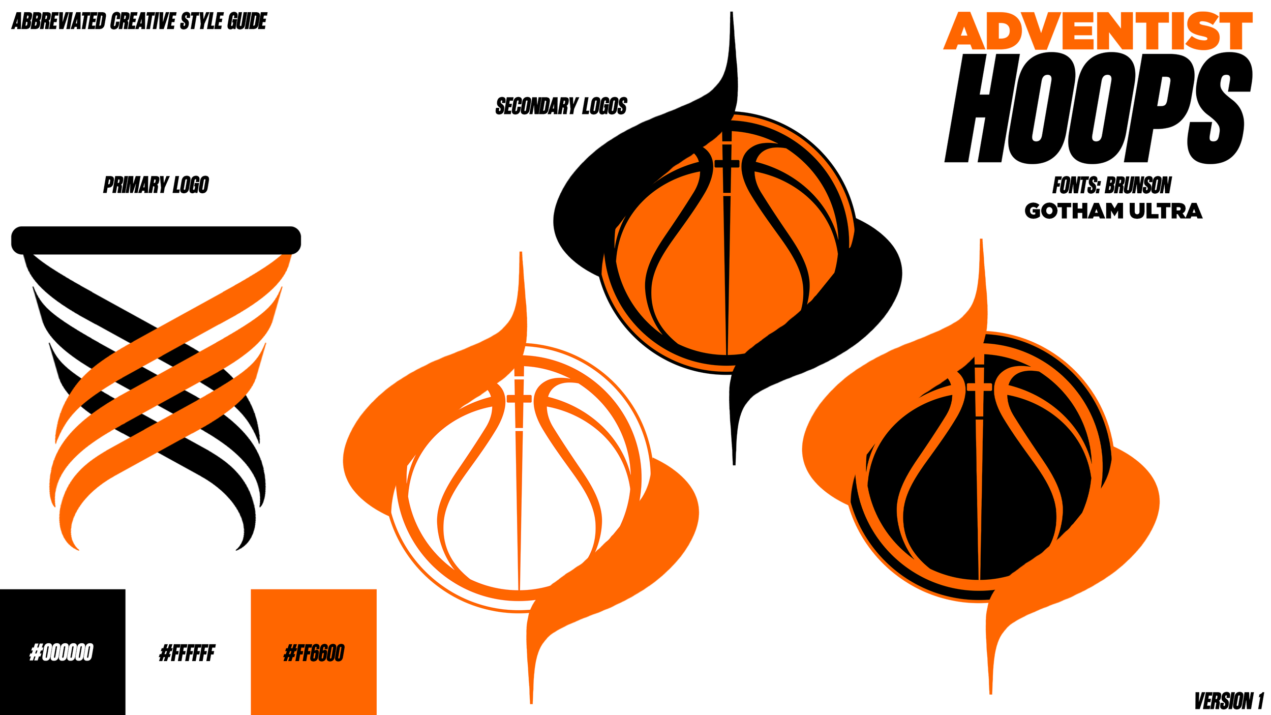
AdventistHoops’ new primary logo
After several rounds of brainstorming and sketching out possibilities, the team honed in on a primary logo design that incorporated a rim and net in which the same flame could still exist. “I think that what makes AdventistHoops great is its uniqueness,” said Meridith. “The Seventh-day Adventist Church is known around the world, and we wanted to incorporate elements that gave a nod to the Church but still stayed in line with the image that AdventistHoops has created.” A secondary logo honors the original one, with a basketball encircled by a flame, and a small cross at the intersection of the ball seams.

AdventistHoops’ new secondary logo
These new logos, colors, and fonts take the AdventistHoops brand to the next level. Not only does the community love the new look, it solved some technical issues as well. Needless to say, I’m very happy with how it all turned out. My thanks to Jason and Lucas for all of the time and energy it took to make this happen.
“I think this new look gives Adventist basketball a strong foundation for the future,” said Meridith. “I'm so proud and grateful for the team and all the contributions on this project, and am so excited to see where we continue to go!”